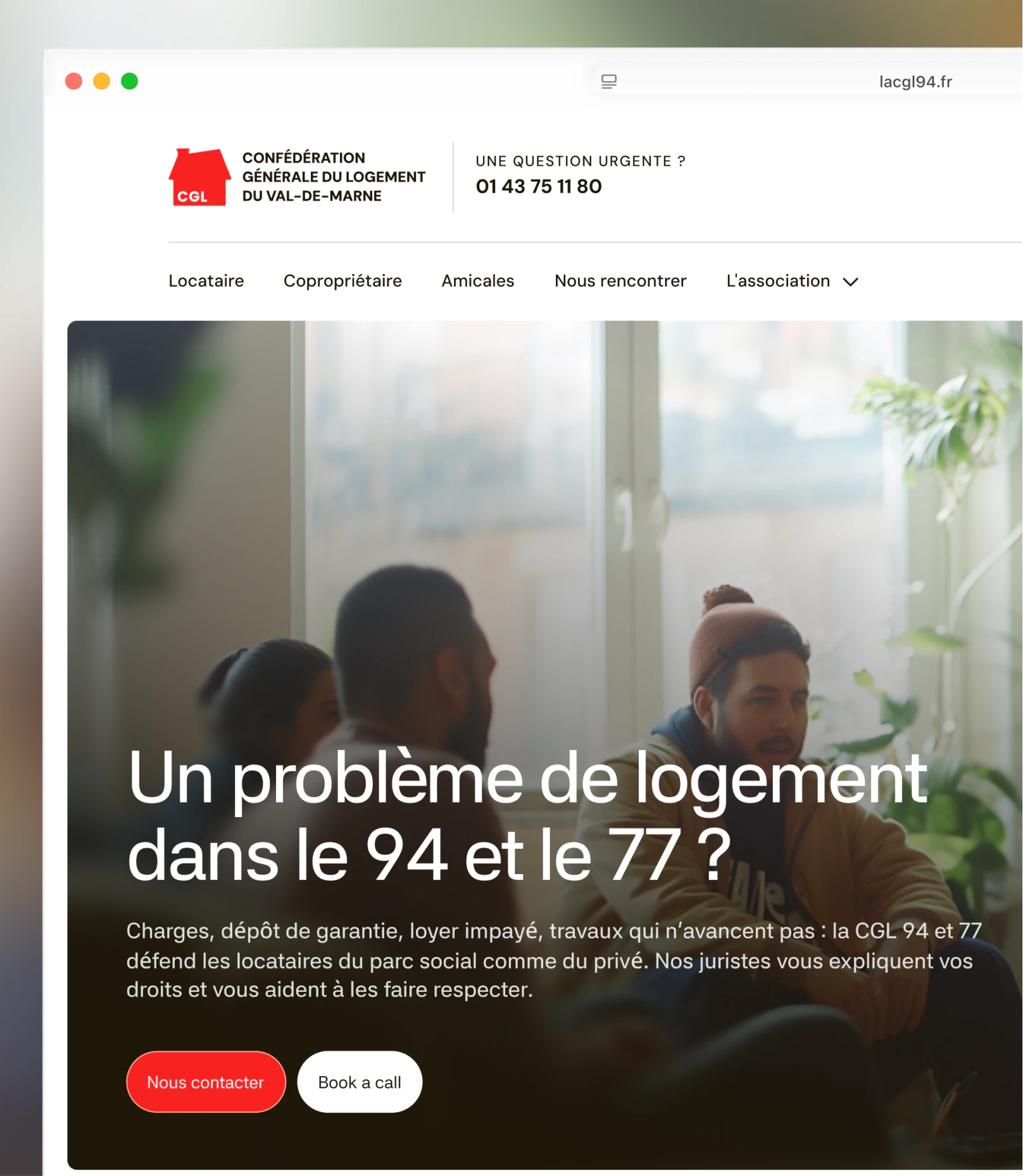
A hundred pages, sorted by who you are, not by what’s wrong
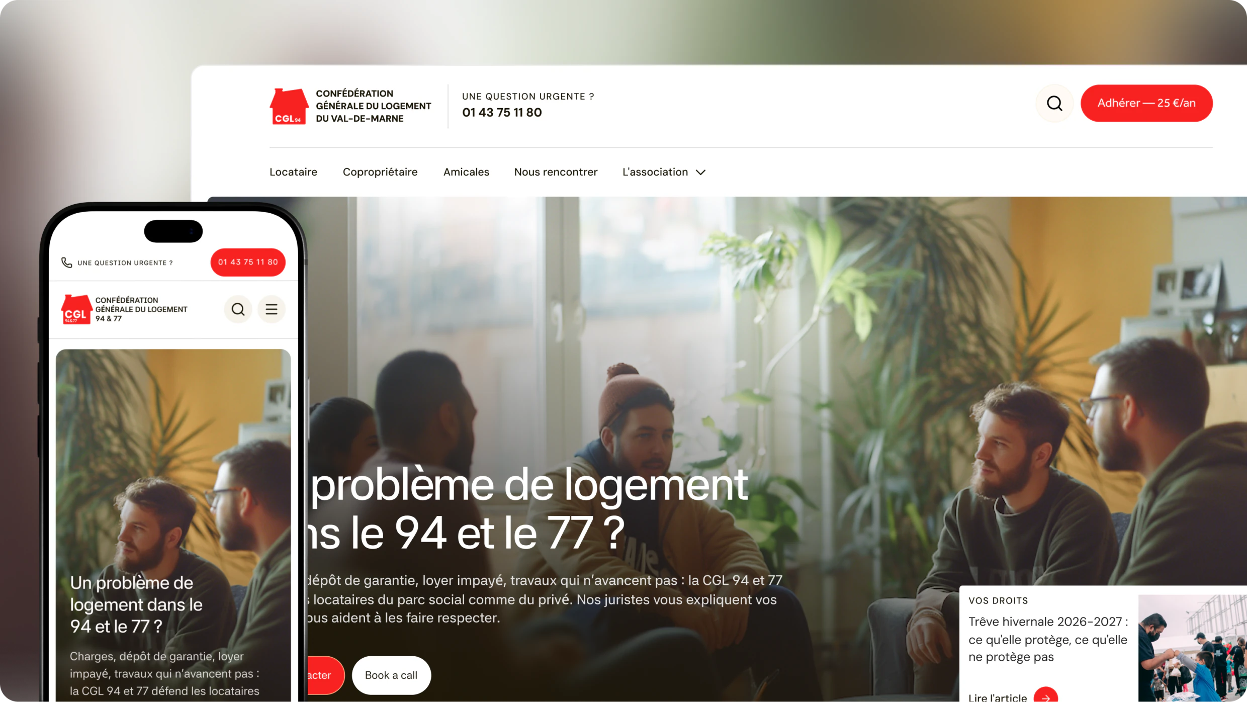
The CGL helps tenants with unpaid rent, a deposit that won’t come back or repairs that never happen, and supports the tenant groups that form in social housing. The old site was a WordPress last fed in August 2021.
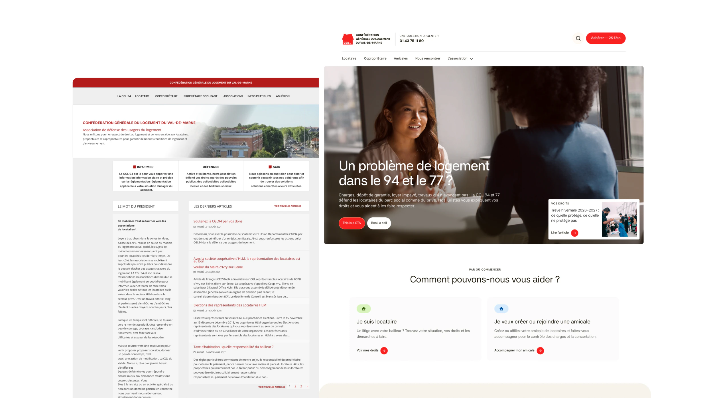
One question on arrival, and every path ends with a volunteer
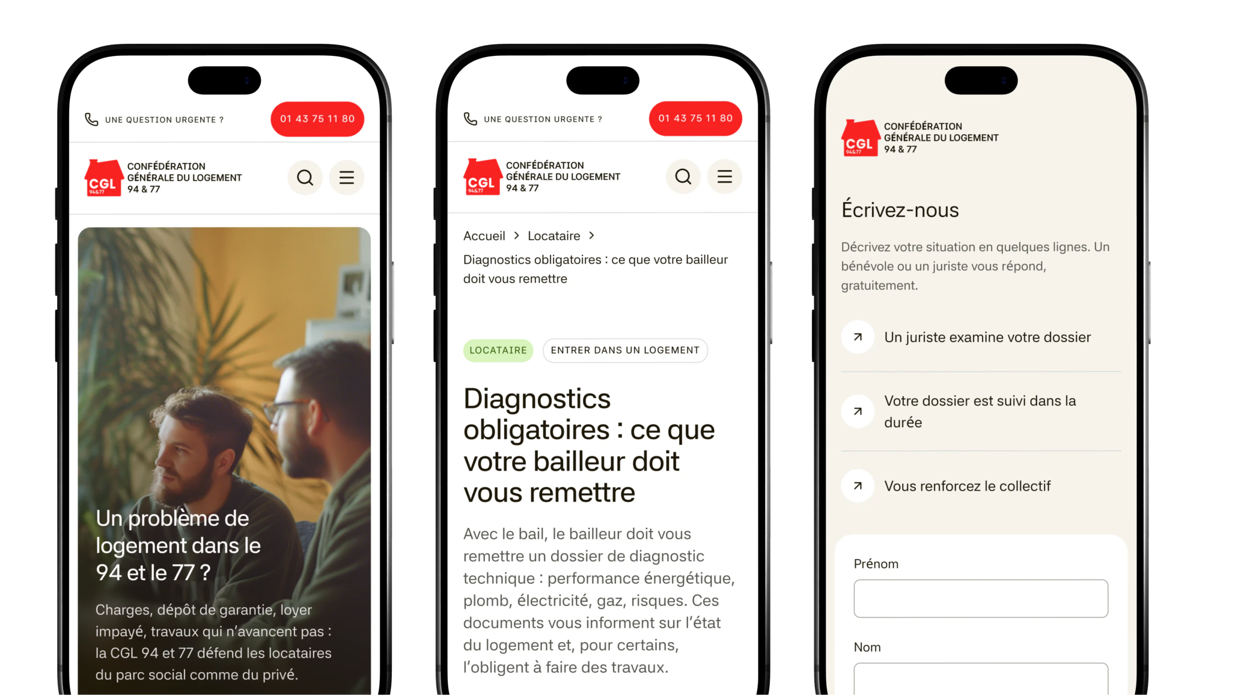
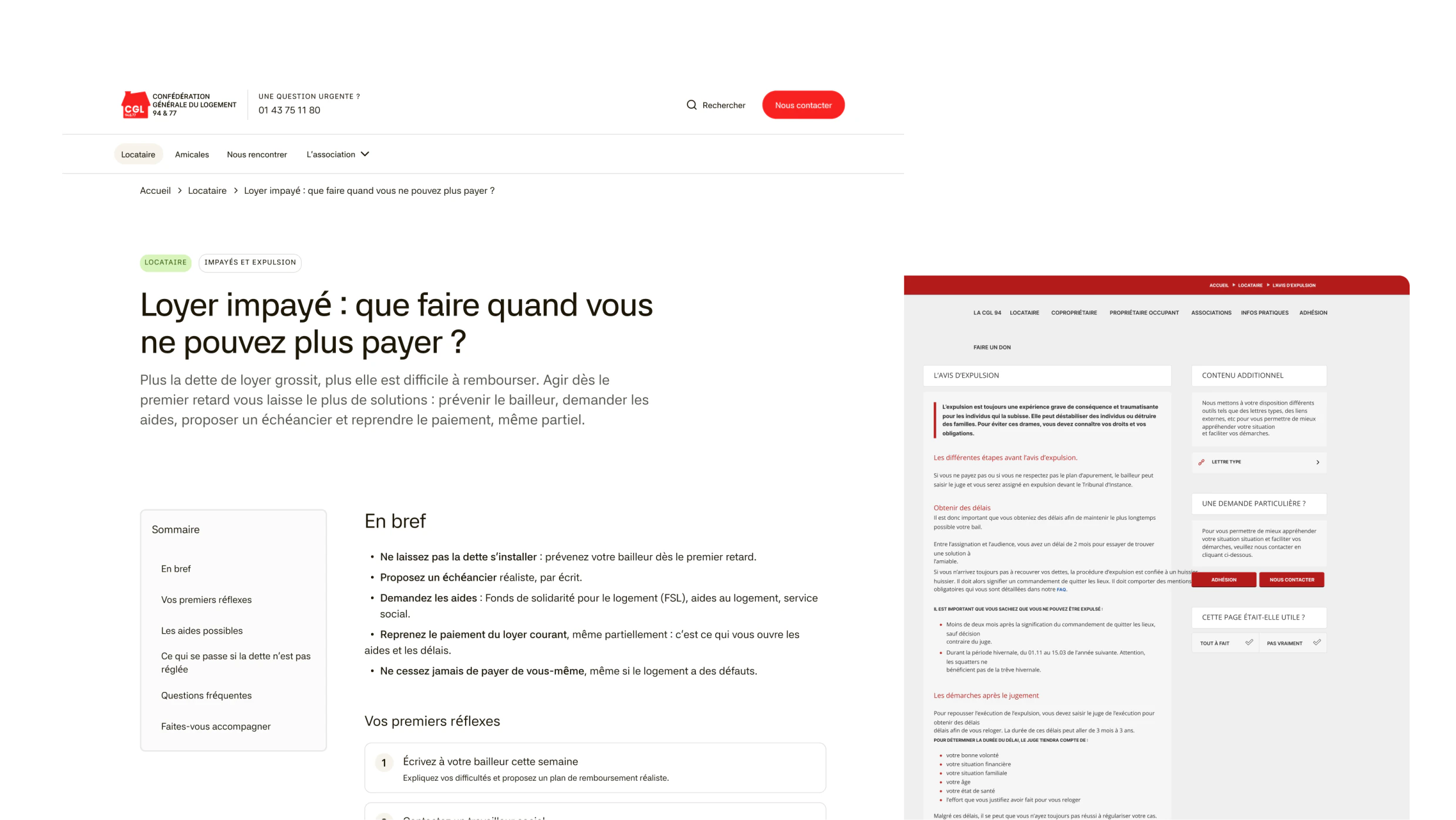
Four decisions between the two sites
I set the structure with the client and the content model before any code, designed in Figma and built with Claude Code. What made the difference were a few choices, each with something given up.
1 · Problems, not statuses. The home asks one question: are you a tenant with a problem, or a tenant group? Two doors, green for tenants, blue for tenant groups, carried through every page behind them. Anyone the association can’t help is pointed to the right place instead of filling in a form for nothing.
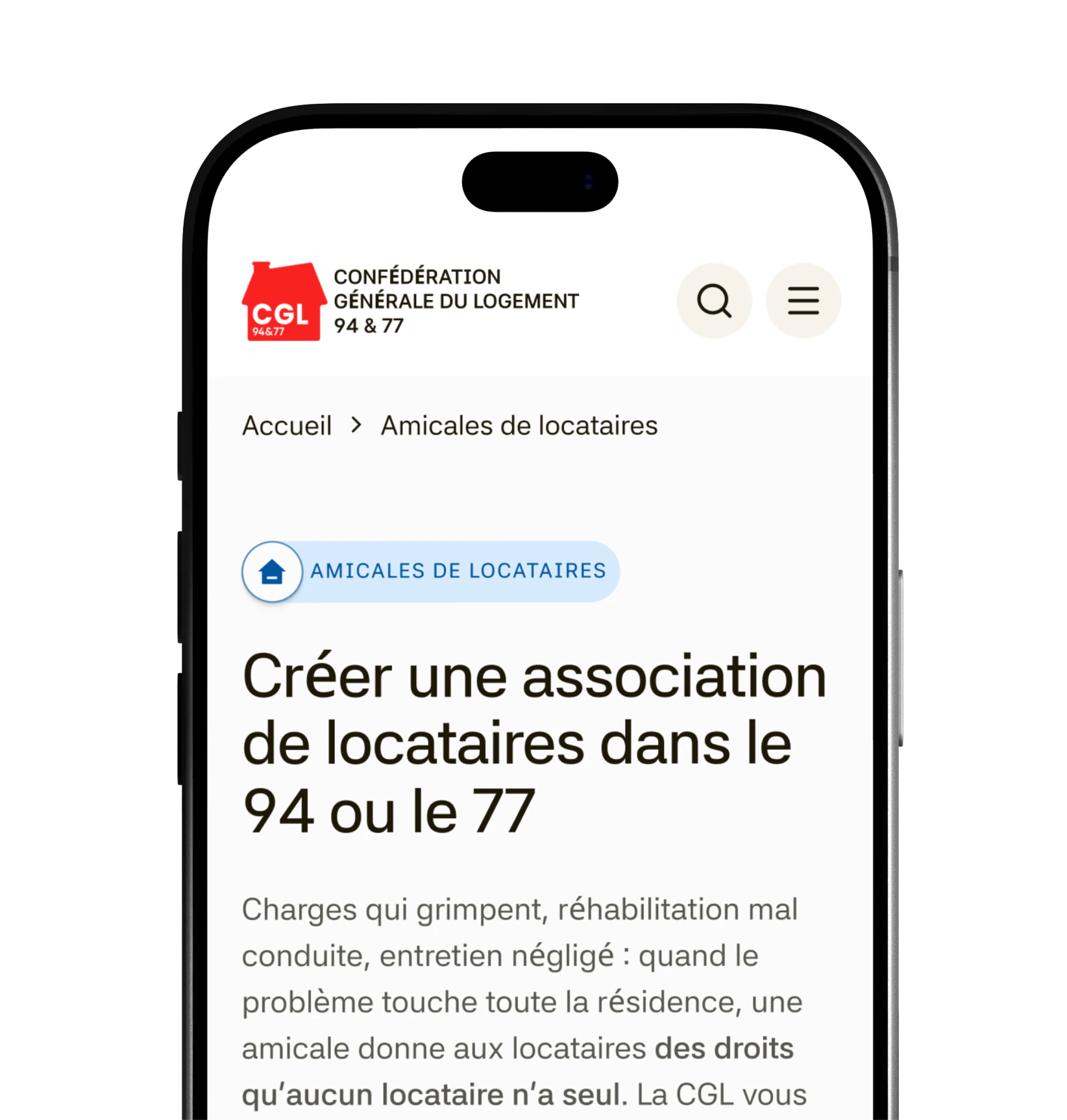
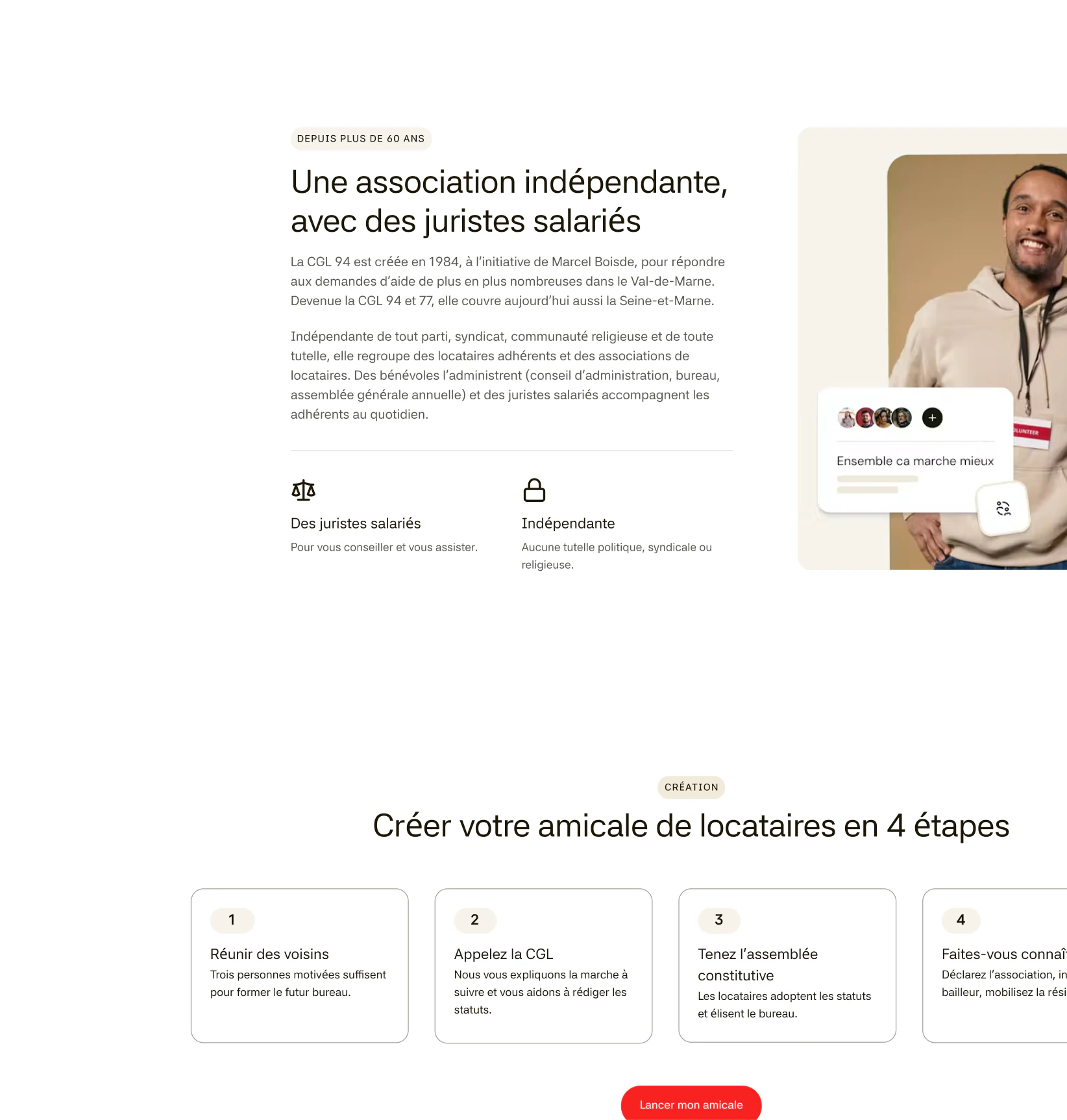
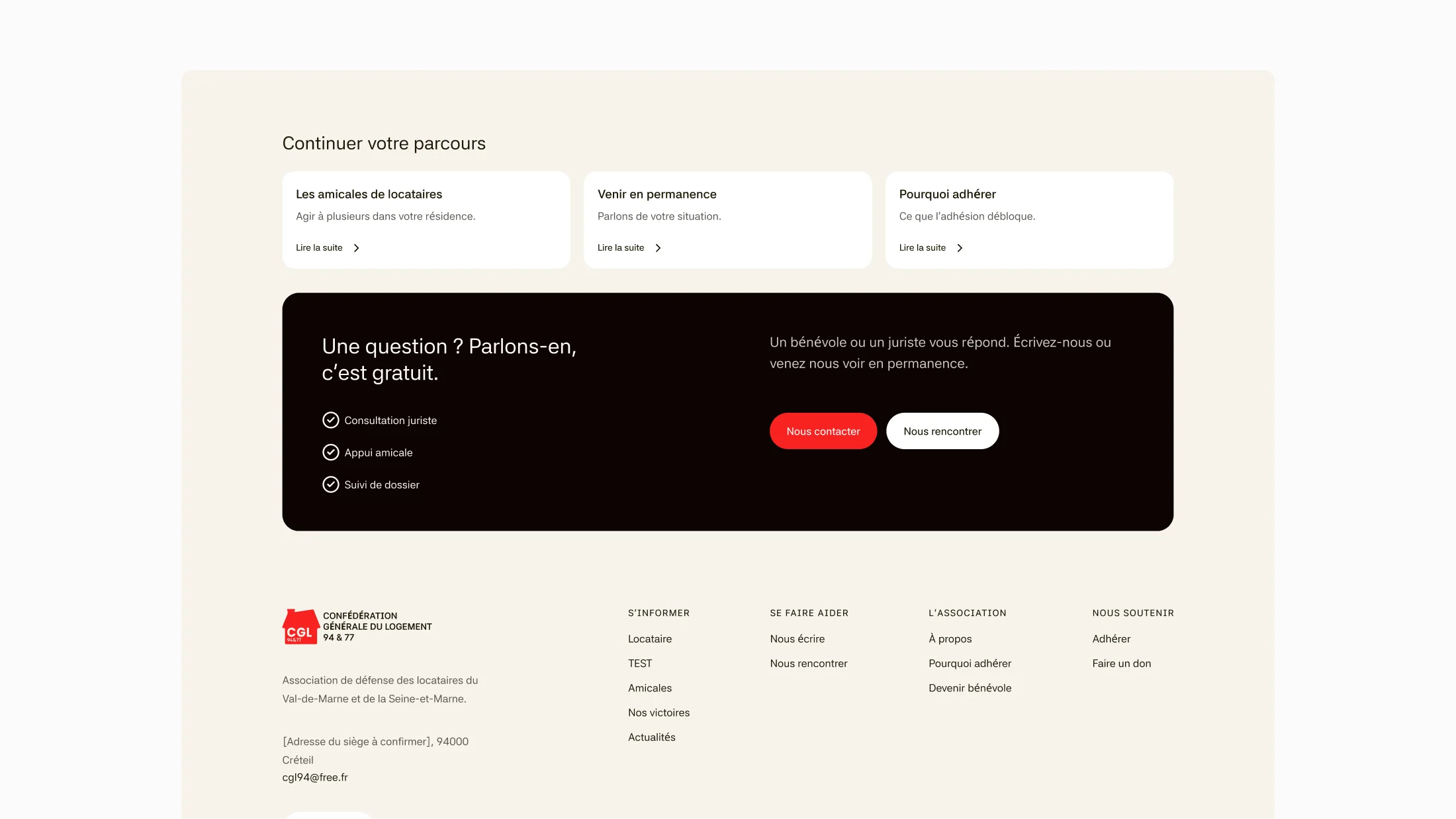
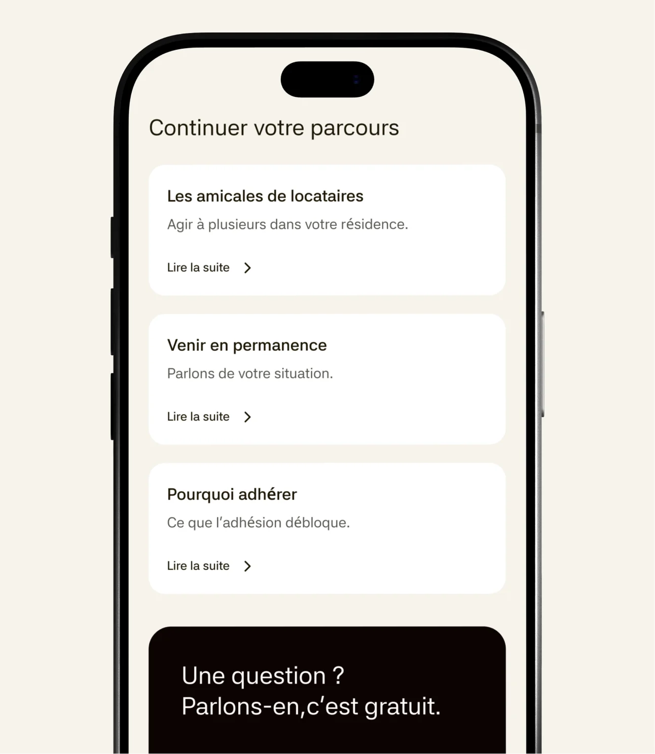
2 · One main action: talk to someone. The main button always leads to contact, then to an in-person meeting, in that order, everywhere. Every “Nous contacter” opens the same form, which adapts to the subject it was opened from, seven in all. No page is a dead end: each closes on a few ways out and a last call to talk.
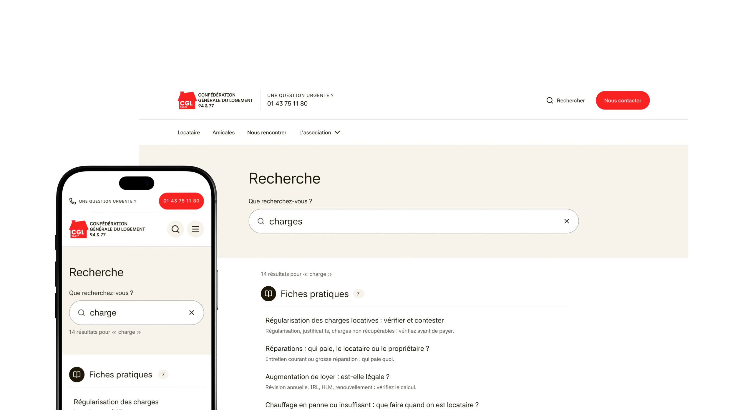
3 · Search: out, then back in. The first version had no search and no analytics. I put search back after looking at who reads the guides: older people typing their own words, caution, huissier, proprio, rarely the legal term. It forgives a typo, knows the synonyms, and opens as a panel under the header.
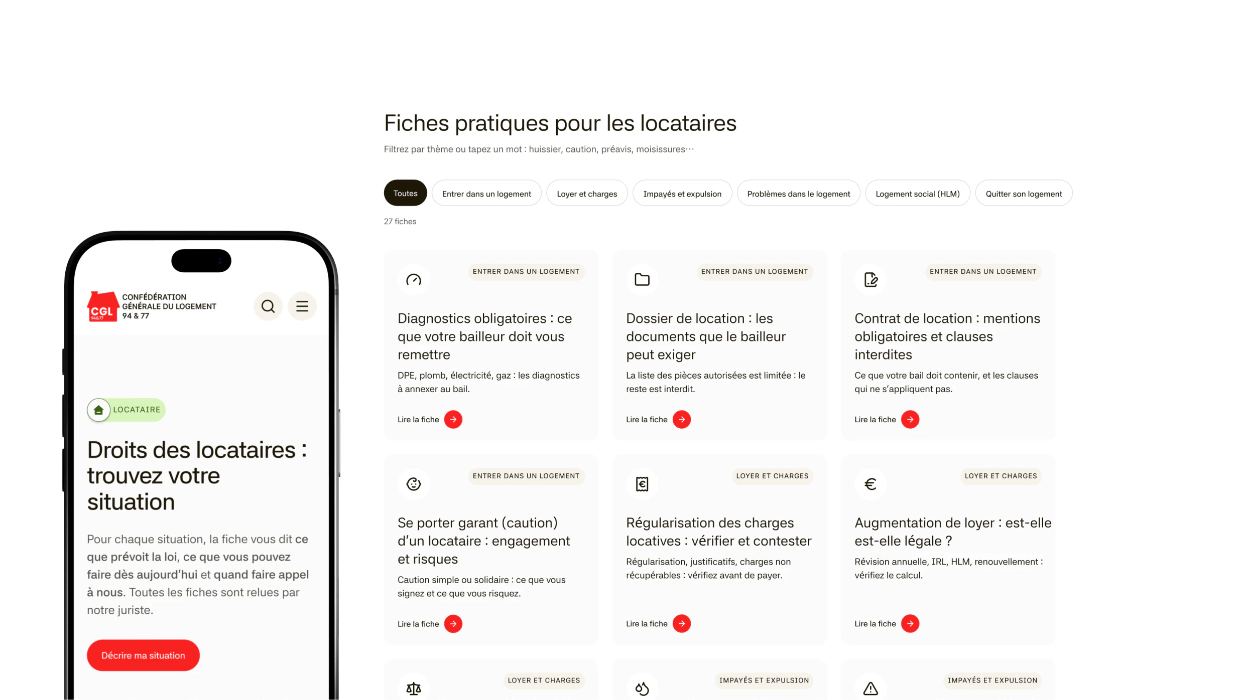
4 · Nothing the old site didn’t say. The practical guides, the fiches, are the heart of the site. I had the old site scraped into text, rewrote 20 guides from it in plain language and added 6 that people were searching for. Each has a table of contents that follows you, numbered steps and the guides that come next. The wording changed; the legal claims didn’t.
A CMS an older volunteer can use
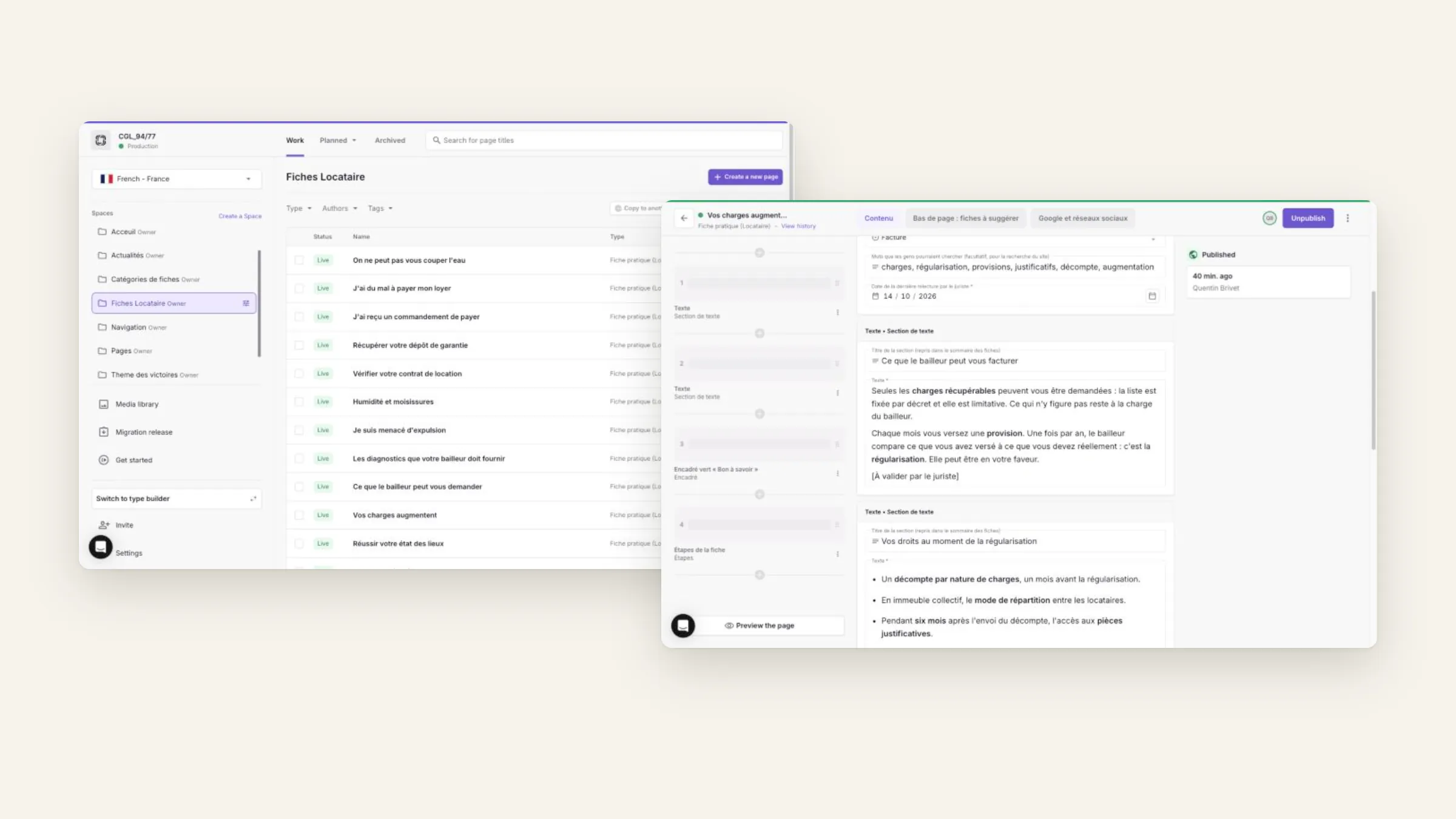
The site is only as good as the last person who updated it. I went through Prismic as an editor would and took out everything that asked a question they couldn’t answer. Blocks got plain-French names, “Grand bandeau de l’accueil” instead of hero, and a picture of each of their 25 variations. Settings went from ten tabs to six, 17 of 22 technical anchor fields went away, and the fields that remain have limits.
Content first, the CMS second, the front last
The order did most of the work. Each step settled what the next one would build on, so nothing had to be redone once the code started.
The structure, with the client. Before anything else I specified the paths I saw: a tenant in trouble, a group starting a tenant association, a member, a volunteer. Then I had the whole old site scraped into text and, from that content and those paths, built low-fidelity wireframes with AI. I took them to the association and we refined them together, page after page, until the whole structure was agreed.
Then the design system, in Figma. On that structure I designed the system, tokens, type, components, and the blocks that carry the site: the page headers, the two doors, the guide. Pencil came after, as the way to hand the mock-ups to Claude Code, frame by frame.
Every field decided before any code. From what we had agreed with the client, I wrote the content model in full: every page type, every block, every field, with its variations. Then I designed those blocks in Figma against that list, so each one already knew what an editor would fill in.
The CMS, set up in one go. The model went into Prismic by script: page types, blocks, fields, plain-French labels and a picture for each variation. The old guides were migrated into it, ready for the association to review and publish.
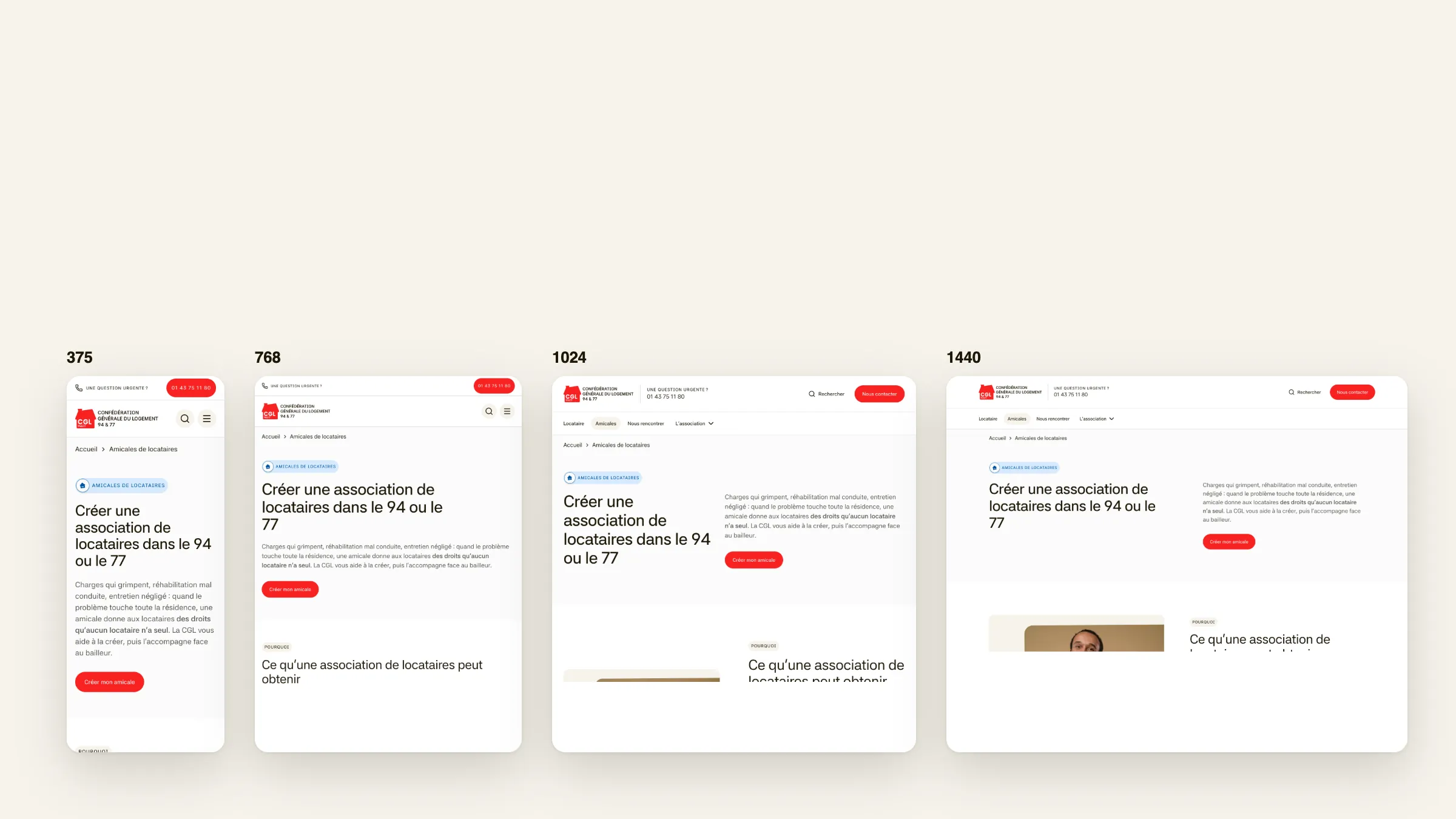
The front, one block at a time. With Claude Code, each block was coded from its frame, alone on a design system page with sample content, checked at four widths, then wired to its block in Prismic before the next one started.